NEAR Concentration Index and RSI Data Update
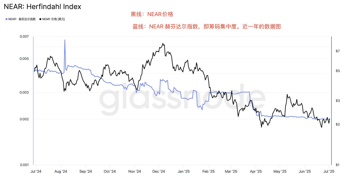
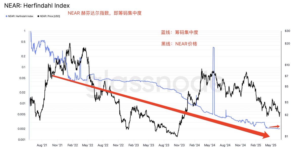
The trend of the concentration index over the past year and the RSI data chart, with the trend chart from April to now. @NEARProtocol
@NEARProtocol The Herfindahl index measures the proportion of addresses in the current supply, defined as the weighted total of address balances in the network. A high score indicates a high concentration of supply, while a low score indicates a more even distribution of funds across addresses.
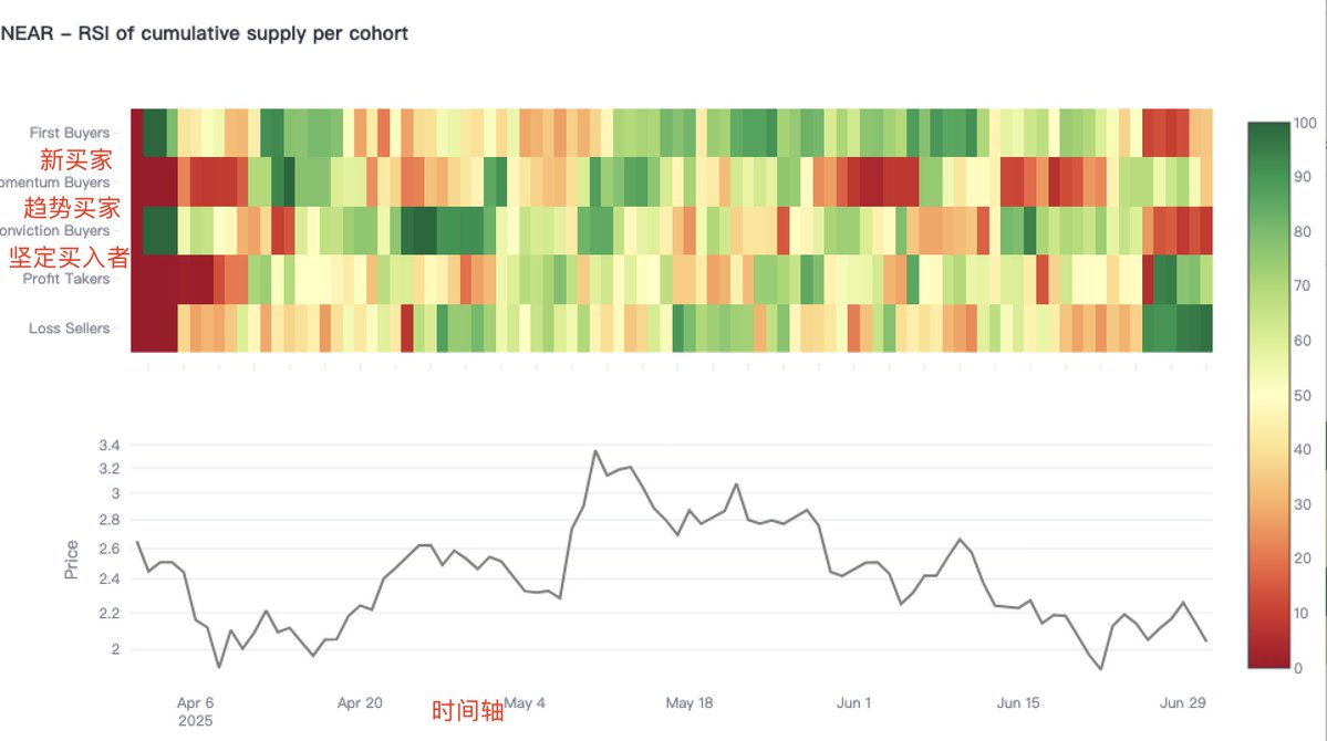
@NEARProtocol The cumulative supply of each queue helps identify when specific groups are heating up or cooling down. Green values indicate increasing activity, while red values indicate slowing or stagnating activity.
As shown in the figure below, for reference and learning, thank you all.


NEAR's RSI data @NEARProtocol
Classifying token supply based on the behavior of market participants. We are no longer just focusing on supply levels, but observing who is buying and who is selling. Are these mainly buyers entering the market for the first time? Are we seeing steadfast buyers stepping in when prices drop? Or is the current activity driven by momentum buyers, profit-takers, or loss-sellers? To this end, we have created a set of behavior-based groups: @NEARProtocol
Steadfast Buyers: Investors who continue to buy even when prices are falling. They believe in the long-term trend and use this to lower their cost basis.
Momentum Buyers: Investors who buy during an upward trend, usually increasing their average cost basis.
First-Time Buyers: Buyers entering the market for the first time—a brand new starting point.
Loss Sellers: Investors exiting at a loss.
Profit-Takers: Investors locking in profits.
We applied a 30-day Relative Strength Index (RSI) to the cumulative supply held by each group. This not only tells us the supply they hold but also reflects the recent activity levels of each group—are they rapidly accumulating or selling off? Or are they remaining neutral?
When momentum buyers start to become active, it may signal the beginning of a new trend.
When steadfast buyers begin to yield and turn into loss sellers, it may trigger a capitulation moment.
When momentum buyers turn into profit-takers, it may indicate the emergence of a local top.
When first-time buyers surge, it may suggest that "fear of missing out" is entering the market—this is often a sign of a highly volatile market environment.
The chart below shows the cumulative supply of each queue, helping to identify when specific groups are heating up or cooling down. Green values indicate increasing activity, while red values indicate slowing or stagnating activity.
For reference and learning, thank you all.
@KaitoAI @NEARProtocol

13.13K
97
The content on this page is provided by third parties. Unless otherwise stated, OKX is not the author of the cited article(s) and does not claim any copyright in the materials. The content is provided for informational purposes only and does not represent the views of OKX. It is not intended to be an endorsement of any kind and should not be considered investment advice or a solicitation to buy or sell digital assets. To the extent generative AI is utilized to provide summaries or other information, such AI generated content may be inaccurate or inconsistent. Please read the linked article for more details and information. OKX is not responsible for content hosted on third party sites. Digital asset holdings, including stablecoins and NFTs, involve a high degree of risk and can fluctuate greatly. You should carefully consider whether trading or holding digital assets is suitable for you in light of your financial condition.

