是時候投票選出 @jup_mobile v2 應用程式主題設計大賽的獲勝者了。
查看下面的 4 名決賽選手(每人獲得 $1k),然後在 X 上投票選出您最喜歡的
👇

選項1
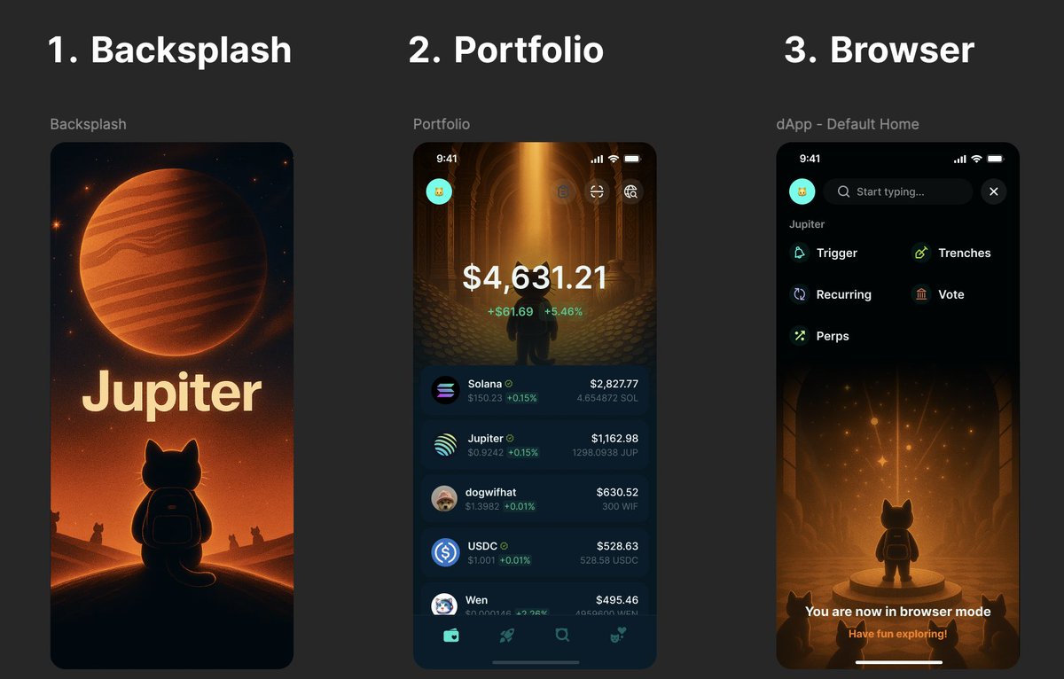
Here’s my submission to reimagine the Jupiter Mobile App.
I spent the past week redesigning its 3 core screens — not for aesthetics, but to tell a better brand story.
With 15 years in global brand-building, I approached this less like a UI exercise, and more like a narrative system designed to onboard, engage, and elevate the next billion into DeFi.
This is my process and my thinking behind the work:
1. Splash Screen → “The Call to Jupiter”
- Not a loading screen. A moment of initiation.
- A lone cat beneath a massive, glowing Jupiter.
- It’s symbolic, cinematic — designed to stir something deeper.
You’re not opening an app. You’re entering the Jupiverse.
2. Portfolio Screen → “Vault of Value”
- This is your sanctuary. A golden chamber, filled with clarity.
- I didn’t want numbers floating in space — I wanted meaning.
- The lighting, the symmetry, the scale — it all reinforces value.
You don’t just view your balance. You feel ownership.
3. Browser Screen → “The Constellation of Discovery”
- This one had to land hard.
- A lone figure. A cosmic pedestal. The stars responding.
- It’s not about tapping tiles — it’s about unlocking potential.
Protocols become constellations. Community becomes gravity.
This wasn’t just a UI refresh.
It’s a neuro-design reset — built around story, emotional memory, and purpose.
From awe → to empowerment → to belonging.

12.98萬
844
本頁面內容由第三方提供。除非另有說明,OKX 不是所引用文章的作者,也不對此類材料主張任何版權。該內容僅供參考,並不代表 OKX 觀點,不作為任何形式的認可,也不應被視為投資建議或購買或出售數字資產的招攬。在使用生成式人工智能提供摘要或其他信息的情況下,此類人工智能生成的內容可能不準確或不一致。請閱讀鏈接文章,瞭解更多詳情和信息。OKX 不對第三方網站上的內容負責。包含穩定幣、NFTs 等在內的數字資產涉及較高程度的風險,其價值可能會產生較大波動。請根據自身財務狀況,仔細考慮交易或持有數字資產是否適合您。


