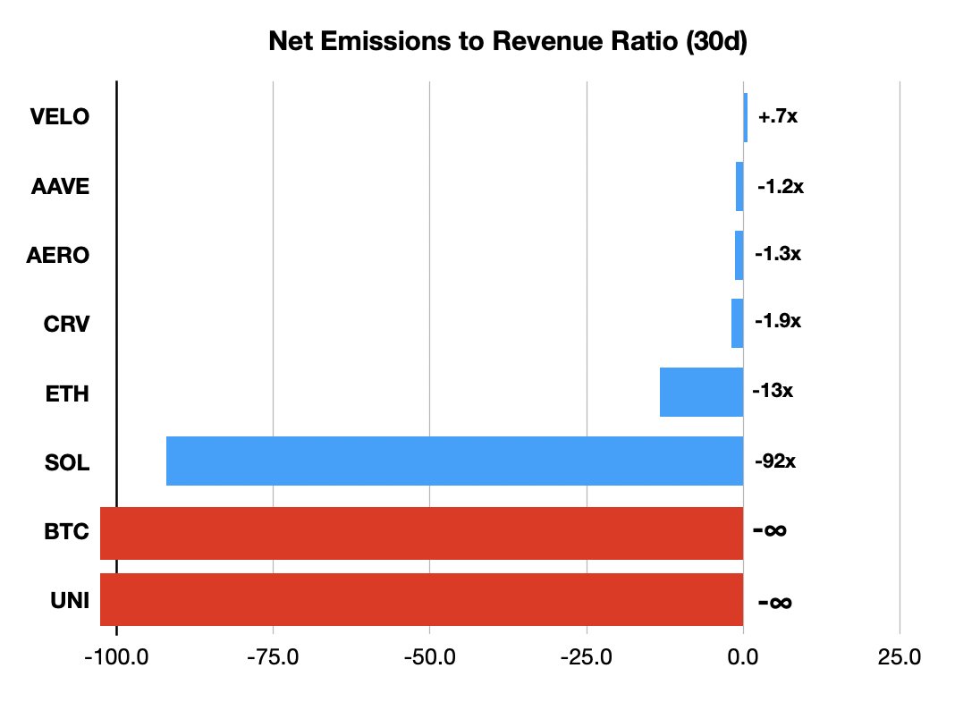
90% of the Top 50 tokens look like the bottom three: insane or literal infinite emissions to revenue ratios.
Yet, 90% of the concern trolling about "sustainability" is around tokens like the first five with healthy ratios.
This is THE source of so many of our problems.

You can go a long way in fixing this with a definitive graphic that normalizes all tokens.
Smth like @artemis's net flow chart, but net value.
Every insider token hitting circulation is treated the same as "emissions", netted against REVs to token.
Most would be ∞ negative.
43.59K
141
The content on this page is provided by third parties. Unless otherwise stated, OKX is not the author of the cited article(s) and does not claim any copyright in the materials. The content is provided for informational purposes only and does not represent the views of OKX. It is not intended to be an endorsement of any kind and should not be considered investment advice or a solicitation to buy or sell digital assets. To the extent generative AI is utilized to provide summaries or other information, such AI generated content may be inaccurate or inconsistent. Please read the linked article for more details and information. OKX is not responsible for content hosted on third party sites. Digital asset holdings, including stablecoins and NFTs, involve a high degree of risk and can fluctuate greatly. You should carefully consider whether trading or holding digital assets is suitable for you in light of your financial condition.

