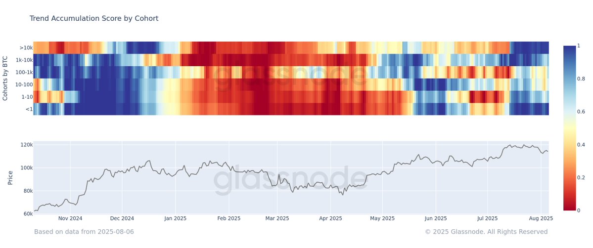
Today, this heatmap image is being shared a lot on X. I used to often analyze on-chain $BTC and see this as a long-term buy/sell indicator.
However, if we compare from the end of 2024, when the whales are buying in (green) and from January to April 2025 when the whales are selling out (red)
=> clearly, they are buying at the peak and selling at the bottom. So looking at this chart, I feel it's "just okay" and I can't completely fomo into it 🤣
Both ultra-large holders (>10K $BTC) and retail investors (<1 $BTC) have, on average, accumulated over the past 15 days. This suggests initial dip-buying during the recent correction. However, the signal is lagging, reflecting smoothed behavior over a 15-day window.

3.78K
14
The content on this page is provided by third parties. Unless otherwise stated, OKX is not the author of the cited article(s) and does not claim any copyright in the materials. The content is provided for informational purposes only and does not represent the views of OKX. It is not intended to be an endorsement of any kind and should not be considered investment advice or a solicitation to buy or sell digital assets. To the extent generative AI is utilized to provide summaries or other information, such AI generated content may be inaccurate or inconsistent. Please read the linked article for more details and information. OKX is not responsible for content hosted on third party sites. Digital asset holdings, including stablecoins and NFTs, involve a high degree of risk and can fluctuate greatly. You should carefully consider whether trading or holding digital assets is suitable for you in light of your financial condition.


